Moringa
A website that educates farmers in tropical regions about the entire process of monetizing the Moringa plant, from cultivation to processing into final end products.
Role
Research
Interaction Design
User-testing
Illustration
Tools
Figma
Adobe Suite
Miro
Team
Anvika Bharadwaj
Emmanuel Ebhota
Guilia Victorya
Ramineh Visseh
Slimara Menezes
Yulia Stan
Discovery
This was the project from an internship with Evolve X branding agency in Vancouver. The project brief handed to the team instructed us to design a digital guide from scratch that will provide individuals with all the information needed for starting a Moringa plant business. The plan encompassed the beginning stage of acquiring the right equipment, space and seedlings all through processing and transportation. From the beginning, we had to research what form the digital guide should take. After research, we settled on a website because it would make the information easier to access. We prioritised a mobile site because most of the end-users had more access to mobiles phones than any other electronic.
Moringa
I had the opportunity to help create from scratch a website that would empower people in tropical regions by educating them on how to monetize the Moringa plant. Many farmers in Africa especially were interested in the Moringa plant for its versatility. It could be used for medical purposes in numerous situations, but it needs to be cultivated and processed in the right conditions else it could be damaged.
Problem
There was an instruction manual on how to start a Moringa farm, but it was bulky and information was hard to find. It being in paper form also meant it would be hard for information to be shared, maintained and updated. Another part of the problem was location. The end-users are mainly located in Africa and the Caribbean, so it made it difficult to interact. Their location was also taken into mind when the product was designed.
Opportunity
An opportunity arose for the creation of a new and fully functioning medium by which information could be maintained, updated and shared with those who need it. Since it was from the ground up, it was possible to tailor the product to each respective market or country.
Design
After completing the research phase, and becoming familiar with the topic and problem, we started thinking of ways to produce a viable solution. Most of the insights of this phase came from competitive research and industry research. These two research segments were especially important because they indicate the practises of designing for this field.
The first two steps were to produce sketches and perform typography research so as to establish font guidelines for the whole website. A type scale calculator was used to establish the right scale for all fonts for the project. The font chosen was Rubik.

Typography and Iconography
The first two steps were to produce sketches and perform typography research so as to establish font guidelines for the whole website. A type scale calculator was used to establish the right scale for all fonts for the project. The font chosen was Rubik.


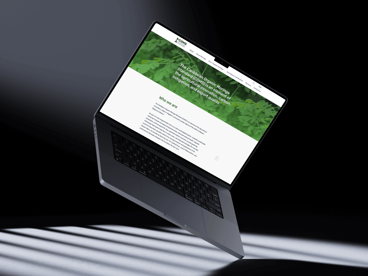
Mockups of the website - Desktop view

Mockups of the website - Mobile view
Usability Testing
After completing the research phase, and becoming familiar with the topic and problem, we started thinking of ways to produce a viable solution. Most of the insights of this phase came from competitive research and industry research. These two research segments were especially important because they indicate the practises of designing for this field.
The first two steps were to produce sketches and perform typography research so as to establish font guidelines for the whole website. A type scale calculator was used to establish the right scale for all fonts for the project. The font chosen was Rubik.
User-feedback
Layout - our assumption of having alternating images and paragraphs being more interesting to read through on desktop was disproved. Users found it confusing and weird, they preferred a consistent single column layout.
Text width is too narrow - while we were following documented best practices and set our text width to be 6 columns wide (to have between 50-70 characters per line), users found it to be too short, and made their eyes jump around too much.
Jumping into content too quickly - Users felt they needed an intro for the topic discussed, rather than just starting to read about it.

New Layout
Old Layout
Final Designs
We refined our wireframes one more time, creating a consistent colour palette of Kelly green shades combined with the light gray background and a saturated orange for calls to action. I also iterated some of the team's illustrations to give them a more consistent look.


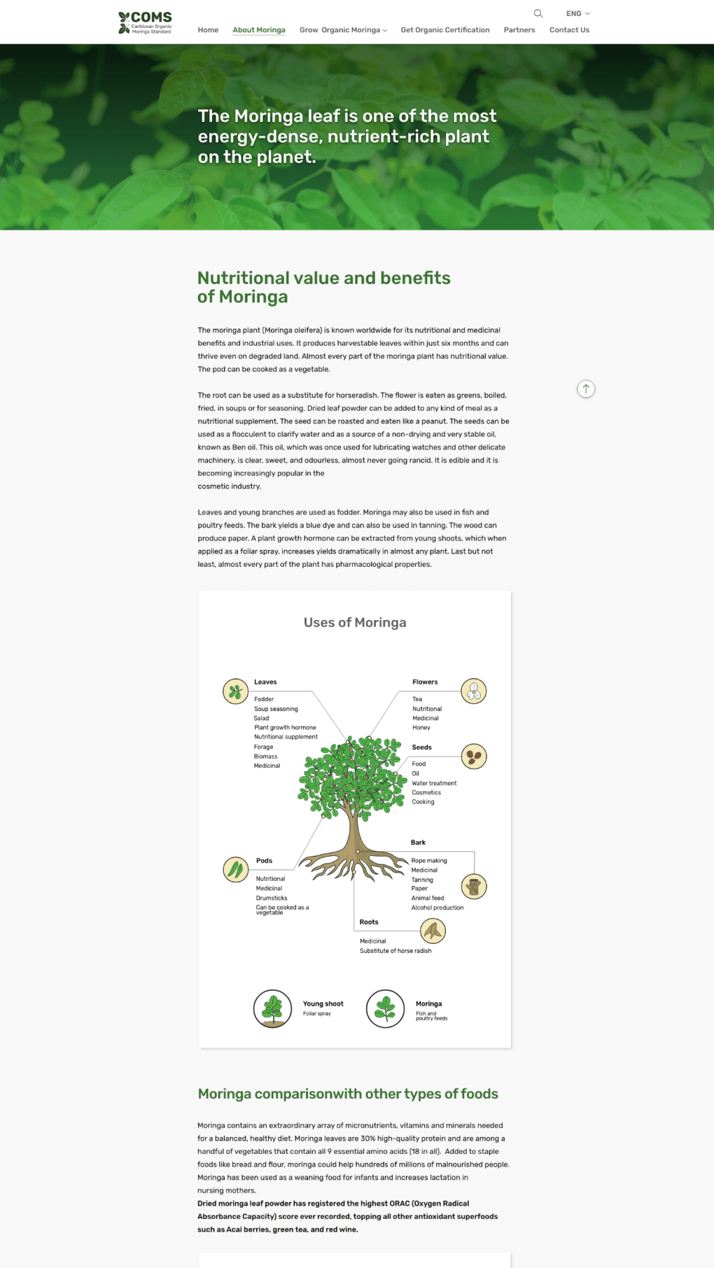
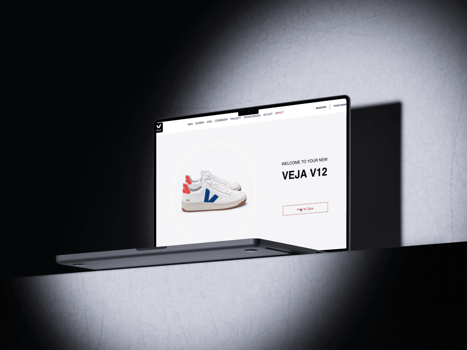
Desktop view - Final Design


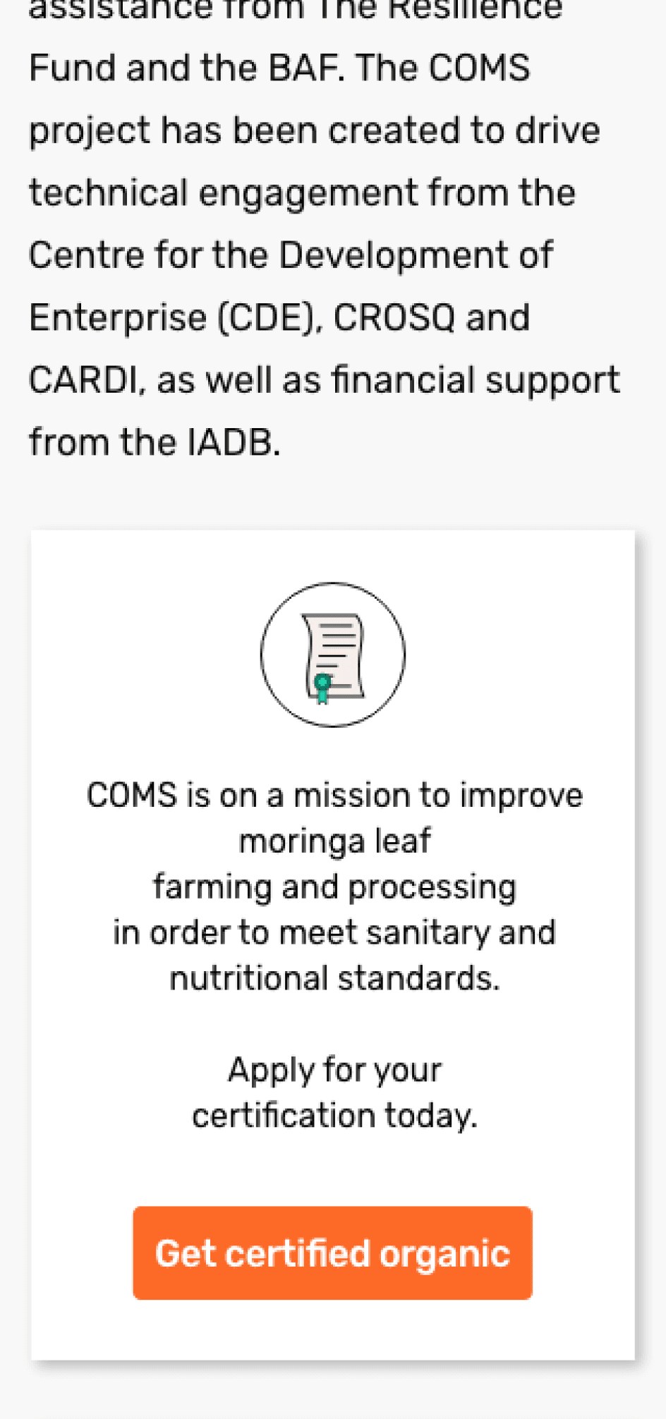
Tablet and Mobile views - Final Design
Dev Handoff
To facilitate a seamless transition for the developers, we made sure to annotate any important notes and measurements. While each team member was assigned to their specific screens to annotate, we collaborated at the end to ensure that all screens were fully prepared for delivery.
Reflections
As a team member, I learned the value of frequent design reviews and standardizing naming conventions, file organization and file share methods (such as online libraries). Also bridging the point of handing things off to a development team had to be considered. The development teams wanted deliverables in Figma, but the team preferred using Adobe XD as the prototyping tool. So we had to create a library for the development team. This shows that all aspects of a project have to be considered early on so that issues do not arise at the end that cannot be solved.
Other Projects


Moringa
A website that educates farmers in tropical regions about the entire process of monetizing the Moringa plant, from cultivation to processing into final end products.
Role
Research
Interaction Design
User-testing
Illustration
Tools
Figma
Adobe Suite
Miro
Team
Anvika Bharadwaj
Emmanuel Ebhota
Guilia Victorya
Ramineh Visseh
Slimara Menezes
Yulia Stan
Discovery
This was the project from an internship with Evolve X branding agency in Vancouver. The project brief handed to the team instructed us to design a digital guide from scratch that will provide individuals with all the information needed for starting a Moringa plant business. The plan encompassed the beginning stage of acquiring the right equipment, space and seedlings all through processing and transportation. From the beginning, we had to research what form the digital guide should take. After research, we settled on a website because it would make the information easier to access. We prioritised a mobile site because most of the end-users had more access to mobiles phones than any other electronic.
Moringa
I had the opportunity to help create from scratch a website that would empower people in tropical regions by educating them on how to monetize the Moringa plant. Many farmers in Africa especially were interested in the Moringa plant for its versatility. It could be used for medical purposes in numerous situations, but it needs to be cultivated and processed in the right conditions else it could be damaged.
Problem
There was an instruction manual on how to start a Moringa farm, but it was bulky and information was hard to find. It being in paper form also meant it would be hard for information to be shared, maintained and updated. Another part of the problem was location. The end-users are mainly located in Africa and the Caribbean, so it made it difficult to interact. Their location was also taken into mind when the product was designed.
Opportunity
An opportunity arose for the creation of a new and fully functioning medium by which information could be maintained, updated and shared with those who need it. Since it was from the ground up, it was possible to tailor the product to each respective market or country.
Design
After completing the research phase, and becoming familiar with the topic and problem, we started thinking of ways to produce a viable solution. Most of the insights of this phase came from competitive research and industry research. These two research segments were especially important because they indicate the practises of designing for this field.
The first two steps were to produce sketches and perform typography research so as to establish font guidelines for the whole website. A type scale calculator was used to establish the right scale for all fonts for the project. The font chosen was Rubik.
Typography and Iconography
The first two steps were to produce sketches and perform typography research so as to establish font guidelines for the whole website. A type scale calculator was used to establish the right scale for all fonts for the project. The font chosen was Rubik.
Mockups of the website - Desktop view
Mockups of the website - Mobile view
Usability Testing
After completing the research phase, and becoming familiar with the topic and problem, we started thinking of ways to produce a viable solution. Most of the insights of this phase came from competitive research and industry research. These two research segments were especially important because they indicate the practises of designing for this field.
The first two steps were to produce sketches and perform typography research so as to establish font guidelines for the whole website. A type scale calculator was used to establish the right scale for all fonts for the project. The font chosen was Rubik.
User-feedback
Layout - our assumption of having alternating images and paragraphs being more interesting to read through on a desktop was disproved. Users found it confusing and weird, they preferred a consistent single-column layout.
Text width is too narrow - while we were following documented best practices and set our text width to be 6 columns wide (to have between 50-70 characters per line), users found it to be too short and made their eyes jump around too much.
Jumping into content too quickly - users felt they needed an intro for the topic discussed, rather than just starting to read about it.
Final Designs
We refined our wireframes one more time, creating a consistent colour palette of Kelly green shades combined with the light gray background and a saturated orange for calls to action. I also iterated some of the team's illustrations to give them a more consistent look.
Desktop view - Final Design
Tablet and Mobile views - Final Design
Dev Handoff
To facilitate a seamless transition for the developers, we made sure to annotate any important notes and measurements. While each team member was assigned to their specific screens to annotate, we collaborated at the end to ensure that all screens were fully prepared for delivery.
Reflections
As a team member, I learned the value of frequent design reviews and standardizing naming conventions, file organization and file share methods (such as online libraries). Also bridging the point of handing things off to a development team had to be considered. The development teams wanted deliverables in Figma, but the team preferred using Adobe XD as the prototyping tool. So we had to create a library for the development team. This shows that all aspects of a project have to be considered early on so that issues do not arise at the end that cannot be solved.
Other Projects
Other Projects


Moringa
A website that educates farmers in tropical regions about the entire process of monetizing the Moringa plant, from cultivation to processing into final end products.
Role
Research
Interaction Design
User-testing
Illustration
Tools
Figma
Adobe Suite
Miro
Team
Anvika Bharadwaj
Emmanuel Ebhota
Guilia Victorya
Ramineh Visseh
Slimara Menezes
Yulia Stan
Discovery
This was the project from an internship with Evolve X branding agency in Vancouver. The project brief handed to the team instructed us to design a digital guide from scratch that will provide individuals with all the information needed for starting a Moringa plant business. The plan encompassed the beginning stage of acquiring the right equipment, space and seedlings all through processing and transportation. From the beginning, we had to research what form the digital guide should take. After research, we settled on a website because it would make the information easier to access. We prioritised a mobile site because most of the end-users had more access to mobiles phones than any other electronic.
Moringa
I had the opportunity to help create from scratch a website that would empower people in tropical regions by educating them on how to monetize the Moringa plant. Many farmers in Africa especially were interested in the Moringa plant for its versatility. It could be used for medical purposes in numerous situations, but it needs to be cultivated and processed in the right conditions else it could be damaged.
Problem
There was an instruction manual on how to start a Moringa farm, but it was bulky and information was hard to find. It being in paper form also meant it would be hard for information to be shared, maintained and updated. Another part of the problem was location. The end-users are mainly located in Africa and the Caribbean, so it made it difficult to interact. Their location was also taken into mind when the product was designed.
Opportunity
An opportunity arose for the creation of a new and fully functioning medium by which information could be maintained, updated and shared with those who need it. Since it was from the ground up, it was possible to tailor the product to each respective market or country.
Design
After completing the research phase, and becoming familiar with the topic and problem, we started thinking of ways to produce a viable solution. Most of the insights of this phase came from competitive research and industry research. These two research segments were especially important because they indicate the practises of designing for this field.
The first two steps were to produce sketches and perform typography research so as to establish font guidelines for the whole website. A type scale calculator was used to establish the right scale for all fonts for the project. The font chosen was Rubik.
Typography and Iconography
The first two steps were to produce sketches and perform typography research so as to establish font guidelines for the whole website. A type scale calculator was used to establish the right scale for all fonts for the project. The font chosen was Rubik.
Mockups of the website - Desktop view
Mockups of the website - Mobile view
Usability Testing
After completing the research phase, and becoming familiar with the topic and problem, we started thinking of ways to produce a viable solution. Most of the insights of this phase came from competitive research and industry research. These two research segments were especially important because they indicate the practises of designing for this field.
The first two steps were to produce sketches and perform typography research so as to establish font guidelines for the whole website. A type scale calculator was used to establish the right scale for all fonts for the project. The font chosen was Rubik.
User-feedback
Layout - our assumption of having alternating images and paragraphs being more interesting to read through on a desktop was disproved. Users found it confusing and weird, they preferred a consistent single-column layout.
Text width is too narrow – while we were following documented best practices and set our text width to be 6 columns wide (to have between 50-70 characters per line), users found it to be too short, and made their eyes jump around too much.
Jumping into content too quickly - users felt they needed an intro for the topic discussed, rather than just starting to read about it.
Final Designs
We refined our wireframes one more time, creating a consistent colour palette of Kelly green shades combined with the light gray background and a saturated orange for calls to action. I also iterated some of the team's illustrations to give them a more consistent look.
Desktop view - Final Design
Tablet and Mobile views - Final Design
Dev Handoff
To facilitate a seamless transition for the developers, we made sure to annotate any important notes and measurements. While each team member was assigned to their specific screens to annotate, we collaborated at the end to ensure that all screens were fully prepared for delivery.
Reflections
As a team member, I learned the value of frequent design reviews and standardizing naming conventions, file organization and file share methods (such as online libraries). Also bridging the point of handing things off to a development team had to be considered. The development teams wanted deliverables in Figma, but the team preferred using Adobe XD as the prototyping tool. So we had to create a library for the development team. This shows that all aspects of a project have to be considered early on so that issues do not arise at the end that cannot be solved.
Moringa
A website that educates farmers in tropical regions about the entire process of monetizing the Moringa plant, from cultivation to processing into final end products.
Role
Research
Interaction Design
User-testing
Illustration
Tools
Figma
Adobe Suite
Miro
Team
Anvika Bharadwaj
Emmanuel Ebhota
Guilia Victorya
Ramineh Visseh
Slimara Menezes
Yulia Stan
Discovery
This was the project from an internship with Evolve X branding agency in Vancouver. The project brief handed to the team instructed us to design a digital guide from scratch that will provide individuals with all the information needed for starting a Moringa plant business. The plan encompassed the beginning stage of acquiring the right equipment, space and seedlings all through processing and transportation. From the beginning, we had to research what form the digital guide should take. After research, we settled on a website because it would make the information easier to access. We prioritised a mobile site because most of the end-users had more access to mobiles phones than any other electronic.
Moringa
I had the opportunity to help create from scratch a website that would empower people in tropical regions by educating them on how to monetize the Moringa plant. Many farmers in Africa especially were interested in the Moringa plant for its versatility. It could be used for medical purposes in numerous situations, but it needs to be cultivated and processed in the right conditions else it could be damaged.
Problem
There was an instruction manual on how to start a Moringa farm, but it was bulky and information was hard to find. It being in paper form also meant it would be hard for information to be shared, maintained and updated. Another part of the problem was location. The end-users are mainly located in Africa and the Caribbean, so it made it difficult to interact. Their location was also taken into mind when the product was designed.
Opportunity
An opportunity arose for the creation of a new and fully functioning medium by which information could be maintained, updated and shared with those who need it. Since it was from the ground up, it was possible to tailor the product to each respective market or country.
Design
After completing the research phase, and becoming familiar with the topic and problem, we started thinking of ways to produce a viable solution. Most of the insights of this phase came from competitive research and industry research. These two research segments were especially important because they indicate the practises of designing for this field.
The first two steps were to produce sketches and perform typography research so as to establish font guidelines for the whole website. A type scale calculator was used to establish the right scale for all fonts for the project. The font chosen was Rubik.
Typography and Iconography
The first two steps were to produce sketches and perform typography research so as to establish font guidelines for the whole website. A type scale calculator was used to establish the right scale for all fonts for the project. The font chosen was Rubik.
Mockups of the website - Desktop view
Mockups of the website - Mobile view
Usability Testing
After completing the research phase, and becoming familiar with the topic and problem, we started thinking of ways to produce a viable solution. Most of the insights of this phase came from competitive research and industry research. These two research segments were especially important because they indicate the practises of designing for this field.
The first two steps were to produce sketches and perform typography research so as to establish font guidelines for the whole website. A type scale calculator was used to establish the right scale for all fonts for the project. The font chosen was Rubik.
User-feedback
Layout - our assumption of having alternating images and paragraphs being more interesting to read through on desktop was disproved. Users found it confusing and weird, they preferred a consistent single column layout.
Text width is too narrow – while we were following documented best practices and set our text width to be 6 columns wide (to have between 50-70 characters per line), users found it to be too short, and made their eyes jump around too much.
Jumping into content too quickly – Users felt they needed an intro for the topic discussed, rather than just starting to read about it.
Final Designs
We refined our wireframes one more time, creating a consistent colour palette of Kelly green shades combined with the light gray background and a saturated orange for calls to action. I also iterated some of the team's illustrations to give them a more consistent look.
Desktop view - Final Design
Tablet and Mobile views - Final Design
Dev Handoff
To facilitate a seamless transition for the developers, we made sure to annotate any important notes and measurements. While each team member was assigned to their specific screens to annotate, we collaborated at the end to ensure that all screens were fully prepared for delivery.
Reflections
As a team member, I learned the value of frequent design reviews and standardizing naming conventions, file organization and file share methods (such as online libraries). Also bridging the point of handing things off to a development team had to be considered. The development teams wanted deliverables in Figma, but the team preferred using Adobe XD as the prototyping tool. So we had to create a library for the development team. This shows that all aspects of a project have to be considered early on so that issues do not arise at the end that cannot be solved.
Other Projects